Reflective Statement

The project’s primary purpose was to explore the keyword ‘emotion’ and use my knowledge and understanding of my practice as an Art Therapist and combine it with my work as an illustrator.

Through my research it has become apparent that it is an expansive field with a range of avenues to explore and within each avenue there appears to be another strand to investigate. In overlaying illustration theory and research with therapeutic theory, I have noted that the dual role I am aiming for is possible and that a collection of work can be created but that it has been challenging and remains so. In Art Therapy you work with the image that the client has created to aid the therapeutic process, whereas in this project it is directive with pre-created illustrations and narrative used to aid the client in their therapeutic process.

The most challenging aspect is to create therapeutic value and allow the client to gain ownership over the narrative but still have strong illustrations that work as an independent project.

Within my research I explored artists and illustrators that created images and narratives that allowed the reader to co-create the story. This has influenced the development of my narrative. As the research progressed I noted that there were recurring themes and that the results were not as eclectic as one might think.

The research has been paramount for me to create a foundation to build a project, with the end goal to create a picturebook or a series of illustrations that focus on loss and bereavement. The research has influenced my thoughts and brought into question the relevance of text in illustrations, what text can add and what text can take away. In returning to my initial aims, allowing the client to take ownership over the narrative and not wanting to dictate to them how they should feel, I reflected upon the use of narrative in my work. I concluded that in some illustrations there will be a need for text and in others there will not, allowing the reader to align their own experiences with the narrative.

Overall the research has been enlightening and challenging. I feel I have only scratched the surface and at times I have felt overwhelmed by the amount of research required and the amount I have wanted to do to support this project. There appears to be a constant tussle between the therapeutic underpinning and the importance and development of the illustrations. I feel there is a lot more than can be explored as I continue the development of this project in FAT2.

I feel at this point in the project, I wish to continue my research through this blog and to reflect further on my practical work alongside that of other illustrators. I notice that I am more confident in my Art Therapy theory as this is a daily practice for me. My research has awakened a thirst to increase my knowledge of illustration theory and create more illustrations. I wish to push the limits of my own capabilities in both fields and continue to develop a project that pulls Art Therapy and illustration into one.
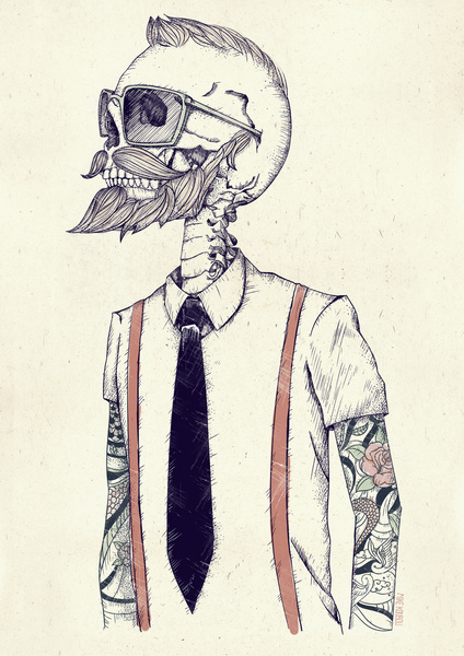
A beautiful depiction of age and beauty

New Years eve I went along to take part in a annual tradition of seeing the BP Portrait Award exhibition in the National Portrait Gallery in Edinburgh.

Tony_gallery+shot_1

[images online] Available at: http://www.jelenabulajic.com/works-radovi/tony-gallery [Accessed 1st January 2015]

Each year offers something new and some portraits, of real intimacy and empathy with the sitter.  This year there is an extraordinary portrait by Jelena Bulajić’s a Serbain artist, which towers over you as you walk into the exhibition. It carries the simple title ‘Tony’.

Tony

Bulajić, J, Tony, 2013, 270 x 200cm, mixed media on linen [images online] Available at: http://www.jelenabulajic.com/works-radovi/tony [Accessed 1st January 2015]

It has a sheen like marble with the layers of smooth wax on it, the layers of wax add a depth and a translucent quality to this beautiful portrait.

The below image is a detail of the portrait of ‘Tony’, the lines remind me of contours on a map, the way the depth of them has been captured and yet a softness to them as well, marking out the rugged landscape of life.

Tony_detail

Bulajić, J, Tony detail, 2013, 270 x 200cm, mixed media on linen.[images online] Available at: http://www.jelenabulajic.com/works-radovi/tony-detail [Accessed 1st january 2015]

Taking a note, I wanted to see more of her work . Jelena Bulajić’s  work brought more than I can imagine to my senses as I viewed more of her amazing portraits. I invite you to look at these images, and notice what thoughts are provoked as your drawn into the details of the paintings.

Marie-Therese

Bulajić, J, Marie-Therese, 2013, 270 x 200cm, mixed media on linen. [images online] Available at: http://www.jelenabulajic.com/works-radovi/marie-therese [Accessed 1st january 2015]

When looking at these portraits it feels as though I am looking at the real person, every mark, line, hair counted for, the attention to detail beautiful yet not overwhelming. They are for me an image that can speak a thousand words, a reflection of life and the beauty of age.

Grozda

Bulajić, J. Grozda, 2014 320x 237cm , mixed media on linen. [images online] Available at: http://www.jelenabulajic.com/works-radovi/grozda [Accessed 1st January 2015]

Although Bulajić’ is not the winner of this year award, she is certainly an artist to watch develop and she won over my curiosity as soon as I walked in through the door.

References

Rich Kelly

Character design, layout, colour pallet, orientation of page, all these things are important in creating a final piece. I am discovering this more as i develop my work. Rich Kelly is an illustrator who’s work which I really like for a lot of different reasons.

[images online] Available at http://rfkelly.com/Yeasayer [Accessed November 14th 2014]

[images online] Available at http://rfkelly.com/Yeasayer [Accessed November 14th 2014]

‘Yeasayer’ is an intricate design packed full of intricate clues as to what the image is communicating. The perspective of above allows the viewer to see more. A piano that appears to be a computer, played by what appears to be a astronaut child, with corn growing out the top. A farmer with a scythe, stood large and looming, with a determined look on his face. Both characters are connected to a computer mainframe. Taking in all this information , leave the ind to wonder, mine come to a point where i wonder if its commenting on the controlled environment in which we all function and even the natural process of farming is controlled and measured by powers out with control, like  large computer.

[images online Available at http://rfkelly.com/Bonnie-Prince-Billy [Accessed 14th november 2014]

[images online Available at http://rfkelly.com/Bonnie-Prince-Billy [Accessed 14th november 2014]

The image ‘Bonnie-Prince -Billy’ I like the simplicity of it, the colours the use of lines to crete the shape of the character, and the placid look on the bears face, making me think he is saying “really your going to hunt me then decide to drink and take a nap on me!”

In an interview for ‘Sketch & Explore’ (2013) Chris Jalufka talk to Rick kelly about his use of colour

‘RK: I only recently began trying to take bolder steps when approaching color. When I typically start a project, color is the last thing on my mind. As I put my ideas down on paper and start to sketch out possible compositions, I try to place a lot of importance on value and contrast, but only when I start to render the final art do I start to think about colour.” (Jalufka 2013)

[images online] Available at http://rfkelly.com/Dr-Dog [Accessed 14th november 2014]

[images online] Available at http://rfkelly.com/Dr-Dog [Accessed 14th november 2014]

this image ‘Dr-Dog’ reminds me of a man who is very knowledgeable and  has had many experiences in life. What I notice when I look, is the expanse of tattoo’s, what each one means and relates to. It has an essence of an intimate portrait, as he is bearing his chest in what appears to be a private space, a study or a library, a private space, much like his body a private reflection of his life.

References

  • Jalufka, C (2013) ‘Sketch & Explore: Interview with Illustrator Rich Kelly’, Evil Tender Dot Com [online] Available at: http://eviltender.com/2013/08/13/sketch-explore-interview-with-illustrator-rich-kelly/ [accessed 14th November 2014]
  • Kelly, R (nd) Portfolio [online] Available at :http://rfkelly.com [accessed 14th November 2014]

Ascension Island

[images online] Available at: http://www.britishempire.co.uk/maproom/ascension/ascension1855.htm [Accessed October 23rd 2014]

[images online] Available at: http://www.britishempire.co.uk/maproom/ascension/ascension1855.htm [Accessed October 23rd 2014]

FAT1’s project and what I intend to continue into FAT2, started as a fascination with Ascension Island. Ascension Island lies in the South Atlantic (7 56′S, 14 22′W) 700 miles northwest of the island of Saint Helena and covers an area of 34 square miles.

Ascension Island is like a place I have never heard of, I instantly started thinking of stories that would work amongst this Island. To gain an understanding I decided I should talk to someone who knows the Island well.

Talking to Tiffany Jones who grew up there, told me many a tale of what it was like below are excerpts from our conversation

Green mountain is tropical and lush with eucalyptus trees, prickly pears, paw-paw trees, banana trees, other tropical plants and bamboo at the peak around a man-made pond called the ‘Dew Pond’

There are big orange and purple land crabs that live in holes all over the mountain.They come down to the sea to nest –

The beaches range from white coral bays to black volcanic coves. There are some fantastic names such as Comfortless Cove, Dead Man’s Beach, Shelly Beach, Crystal Bay, Palm Bay – but the most common places to spot nesting turtles are Long Beach and English Bay.We used to creep down at night to watch them lay their eggs. They are huge creatures and huff and puff as they lay – once they’ve dug a huge hole with their hind flippers.

I grew up in Two Boat’s village and went to the only school on the island ‘Two Boat’s School!’
… trigger fish related to piranhas. They surround Ascension and aren’t dangerous but are ferocious scavengers and the water boils when you throw left overs into the water.

Every Saturday we’d run the Hash (Hash House Harriers) – which was like a paper chase that was set by the ‘hares’ and followed the next day by the ‘hounds’ – it was mainly an excuse to eat and drink loads after a bit of exercise.

Jones, T (2014) ‘In conversation with Laura Cave-Magowan’
[images online] Available at: http://www.nationalarchives.gov.uk/first-world-war/a-global-view/#Ascension%20Island [Accessed 23rd October 2014]

[images online] Available at: http://www.nationalarchives.gov.uk/first-world-war/a-global-view/#Ascension%20Island [Accessed 23rd October 2014]

The Island that is so small is expansive and so rich is so many different ways. I intend to use Ascension Island as a foundation for my idea, as Ascension has grow and formed over the years, I notice my project is also in a transitional state, as I learn more and create more, the narrative also grows and alters.
References
  • Jones, T (2014) ‘In conversation with Laura Cave -Magowan’ purpose to support FAT1 research.

Tattoo’s a silent narrative

 The acceptance of the tattoo has changed, it has become a part of modern culture, adorning the bodies of old and young alike.  The commonality they all hold is that beneath the ink lays a memory an experience that has been etched on their skin for life. Tattoo’s historically were viewed as  antisocial and that people that chose to get them were hitting back at society. What strikes me the most is the clear indicator that it is a way of fitting in, wanting to belong, looking at the history there appear to be groups of people who got tattoos regardless of who they were in society and wanting to gain an individualistic mark, they became part of a group, a group that is inked with emotion.

Woman_with_upper_body_tattooed_1907_cph.3a01441

[images online] Available at ://www.nerdlikeyou.com/sailors-savages-spies-brief-history-tattoos/ [Accessed 30th December 2014]

Gerald Grumet, (1983) wrote a interesting paper ‘Psychodynamic Implications of Tattoo’s,’ the paper although old and a lot of the information is now outdated he acknowledged the significance of the tattoo, over time and as a emotional indicator.

Grumet starts with an overview of the history of tattooing touching on the stone age 12000 B.C stating

“in many savage tribes it was custom to accompany bereavement by slashing the body as evidence of grief and rubbish ashes into the cuts, leaving carbon deposits in the skin. ” (Grumet 1983, p.482)

History-Of-Tattoos-81

[images online] Available at://teulugar.blogspot.co.uk/2013/06/history-of-tattoos.html[Accessed 30th December 2014]

Grumet acknowledges the depth and wide spread use of tattoos in many cultures spanning centuries, used to mark

“puberty ritual, religious emblem, or love charm; protection against danger; sign of mourning for the departed;identification with special qualities of a totemic animal or symbol…” (Grumet 1983, p.483)

Using tattoos in my character I wanted, to depict life experience by the sheer quantity of tattoos and how a place and experience becomes etched in you mind, body and soul, and now etched with ink, a visual for the world to see, like seaman who gained tattoos as a visual representation of the distances they have travelled and the challenges they have faced at sea.

history-of-tattoos-2

[images online] Available at://teulugar.blogspot.co.uk/2013/06/history-of-tattoos.html[Accessed 30th December 2014]

“… a tattoo worn on the skin for many years often assumes symbolic importance becoming a reservoir of emotionally charged memories and talismanic meanings for its bearer.”(Grumet 1983, p.489)

This illustration by Mike Koubou resonates life and experience though the tattoo’s and the use of the skeletal form.  The way Koubou uses a simple colour pallet and fine penmanship bring the character to life, although he is not.

the_gentleman_becomes_a_hipster_

[images online] Available at ://www.mikekoubou.com/illustration.php [Accessed 30th December 2014]

I believe that tattoos are a visual map to someones life, not always to be taken literally, but if spoken about you might happen upon a story which holds deep significance for the tattoo. Used as a way to mark an experience or a significant life event, each tattoo no matter how it may appear as irrelevant is a visual mark and holds a significant narrative.

The design of the tattoo’s is paramount within the character to depict without the use of words his life experiences.

References

  • Grumet, G,(1983), ‘Psychodynamic Implications of Tattoos’, American Orhopsychiatric Association 53 (3) 482-492

Empathy with Images and Narrative

oyster-205x300

[images online] Available at://blogs.crikey.com.au/literaryminded/2010/12/14/guest-review-gerard-elson-on-tim-burtons-the-melancholy-death-of-oyster-boy-and-other-stories/)[Accessed 15th December 2014]

Tim Burton, a man who tells stories which come with a dark shadow. The shadow that intrigues and shows a darker side to tales and fiction, and not ones that have fairytale endings.

In 1997 Burton created ‘The Melancholy Death of Oyster Boy and Other Stories’ a collection of twenty-three illustrated short stories. The stories comprise of a set of characters, all of which are disfigured and seen as not normal. The children come with names, like Roy, the Toxic Boy,  Stain Boy and Oyster Boy. The names alone set of the imagination and create images of children that are seen as outcasts.

burtonart6

[images online] Available at://www.joblo.com/newsimages1/burtonart6-big.jpg [Accessed 15th December 2014]

Gerard Elson spoke about the characters

“…never complain, nor seem embittered, nor seek to settle the score. If they teach us anything, it’s that though life often sucks and other people can be jerks, there’s dignity in not allowing the injustice of it all to corrode your spirit or compromise your character.”

(Elson 2014)

This book explores the harder realities of life, and how if different you can become an outcast, subjected to a lonely life, yet the book gives permission that you may not be alone and that others out there can empathise with how you are feeling.

Returning to thoughts spoken in other posts about who’s need is it to avoid these darker aspects of life, and holding in mind my aim for the course, I returned to the work of Shaun McNiff, an Art Therapist who states

“To those questioning the therapeutic wisdom of welcoming disturbing figures, I can say I have never encountered an image in artwork or dream that came to harm the person experiencing it. A student once said to me “It may come to show me where I hurt, but it doesn’t want to hurt me.”

(Mc Niff, 2004 p.97)

This encompasses the ideal of creating images that do challenge and evoke emotions, and  as Tim Burton’s work clearly shows, it does not need to be explicit, but to resonate with the viewer to have a dual commonalty that the reader can empathise with.

References

  • Meyer, A, (2010) ‘Guest review: Gerard Elson on Tim Burton’s The Melancholy Death of Oyster Boy and Other Stories'[online] Available at http://blogs.crikey.com.au/literaryminded/2010/12/14/guest-review-gerard-elson-on-tim-burtons-the-melancholy-death-of-oyster-boy-and-other-stories/) [Accessed December 15th 2014]
  • McNiff, S,(2004) ‘Art Heals, How Creativity Cures the Soul’, Shambhala, London

Childhood favourite

As I enter in into FAT2, I wanted to think about where my relationship with picturebooks started.For me as a child I was intrigued and my imagination was captured by the creation of Beatrix Potters characters and stories. Jeremy Fisher, Jemima Puddle Duck, Peter Rabbit and Mrs Tiggy Winkle, to name just a few. The tales of there mishaps and predicaments, that always ended well.

jeremy-fisher

[images online] Available at ;http://illustrationwatercooler.wordpress.com/2009/11/15/helen-beatrix-potter/jeremy-fisher/ jeremy [Accessed 28th December 2014]

35-tb

[images online] Available at:http://www.gutenberg.org/files/15137/15137-h/15137-h.htm Tiggy Winkle[Accessed30th December 2014]

As I sit and think about what drew me to the tales, I know it was the thought of talking animals, the familiarity of Beatrix Potters surroundings that I could relate to, the characters which were brimming over with personality, the way a simple animal could tell such a story. As a small child it captured my imagination and allowed me to escape into a different land full of adventure, and things to see. This for me is the most important part, the escapism, the space for the imagination to expand, the space created by Beatrix Potter for the reader to adjust the story so it felt like each rabbit I saw could be part of peter rabbits family, and the grumpy farmer in the village was Mr McGregor.

peter11

[images online] Available at https://www.gutenberg.org/files/14838/14838-h/14838-h.htm Peter rabbit [Accessed 30th December 2014]

Clements (2013) talks about the relationship between text and image as internaimation and stated

“…inter animation engages the reader’s visual imagination to make connections and provide a shape to what is seen optically on the individual page, pair of pages, entire book; it is, in essence, what invites the redaer to co-create the story.” (p.57)

Holding Clement’s thoughts in mind and my reflections of how the scenes depicted by Beatrix Potter were similar to my surroundings, brings me to think about when working how to create stories where the reader can take it to a place of familiarity for them, they to can “co create” the story and gain a interpersonal relationship with the narrative.

References

The macabre in searching for self.

Macabre and illustrations, make me think of dark tales, with twists and turns, much like walking through the forrest at night, its not what you can see, its what your imagination leads you to believe you can’t see.

Chris Odgers encapsulates this sensation for me, beautiful illustrations with tales created for adults and children. Creating limited print runs, making his work collectables, but for me adding to the intrigue and the allusiveness of his work.

1coverfall

[images online] Available at http://www.sawhorse.co.uk/fall-6/%5BAccessed 28th December 2014]

‘Fall’ written and illustrated by Chris Odgers and limited to 1000 copies, is a story of a boy called Harvey, who on Halloween discovers there is a missing jigsaw piece, but more bizarrely the jigsaw piece is from his chest. The tale unfolds as Harvey embarks on a journey, brimming full of metaphor, as friendships are made stronger and Harvey goes in search of his missing part of self.

3fall

[images online] Available at http://www.sawhorse.co.uk/fall-6/%5BAccessed 28th December 2014]

5fall

[images online] Available at http://www.sawhorse.co.uk/fall-6/%5BAccessed 28th December 2014]

Odgers work uses characters and symbols that for most are dark, yet the stories told are not, taking time to delve into the illustrations, the limited colour pallet highlights the intricacies in the drawings and adds a beauty to the perceived darkness.

Odgers work reminds me of a recurring theme within my Art Therapy practice, clients in search of self, their identity, and through the utilisation of Art they can embark on a journey to find themselves, or as Harvey did the missing part of the jigsaw.

References

  • Odgers, Chris, (2003)  ‘Fall’ Atlantic Press, Cornwall.

Final Piece

narrator stitched

Final piece, created for FAT1, mixed media.

This is my final piece from FAT1  a culmination of research and ideas that will be now used as a foundation in FAT2. I found that the project was challenging in that it brought up so many ares that needed to be considered and that FAT1 alone it was not possible to explore all of these aspects.  I feel I was unaware of how much detail I would like to incorpate into the concept and the depths I wish to explore.  The fundamental elements of fusing my Art Therapy practice and my illustration remain at the core of my work and I will continue to use my keyword emotion and a reference point.

Creating a story that is about death, that allows the reader to use their imagination and life experiences to relate to the narrative, and yet the narrative must not dictate to the viewer how that should be feeling.

The character design has felt like a complex process and one that is organic, and as the narrative grows, so does the character.

cha2

Sketchbook, Working Character design for FAT1.

As I step into FAT2 I am intrigued where my research will take me and how this will reflect within my practical work.

Picturebooks without words

Trauma and illustration, picturebooks that explore trauma through narrative, does this narrative require text or is it enough for the illustrations to speak alone to the viewer. In allowing the illustrations to stand alone, does it allow the viewer to create their own narrative, align their own experiences within the narrative of the illustrations, or does the text give them a foundation in with they can build their narrative from and again align to their own personal experiences.

Reflecting on my Art Therapy clinical work, it is focused on providing a space where emotions and experiences can be explored using art as the narrative, as words can be to hard to find to truly express how the client is feeling. In Psychology Today a article Children’s Art as Visual NarrativeMalchiodi (2014) states,

“We now know that non-verbal expressive arts like simple drawing, painting and constructing are effective restorative experiences. Language, a function of declarative memory, is often inaccessible to trauma survivors of any age if the event has been particularly disturbing.”
(Malchiodi 2014)
As I work through these thoughts I feel there is not a definitive answer, as a Art Therapist the client tells their story in their own words, as an illustrator does the same principal remains when creating books focusing on traumatic experiences.
Shaun Tan’s book ‘The Red Tree‘ (2014), depicts a story of a girl’s  world full of dark thoughts and feelings. Tan uses little text or no text, in the book. Text that is used is either interwoven into the illustration or carefully placed on the page pulling the viewer to the image first. Tan expresses his understanding of expressing emotions through illustration
“I’d also been increasingly aware that illustration is a powerful way of expressing of feeling as well as ideas, partly because it is outside of verbal language, as many emotions can be hard to articulate in words. I thought it would therefore be interesting to produce an illustrated book that is all about feelings, unframed any storyline context, in some sense going ‘directly to the source’.”
(Tan, S,  n.d)
red-tree3

[images online] Available at://www.shauntan.net/books.html [Accessed 16th December 2014]

As my works shifts and changes, I am sure so will the use of text, with some work needing more and some requiring less or even none at all. It feels as though it will be subjective to each work produced, and not a exact template for each book or even each page.

References